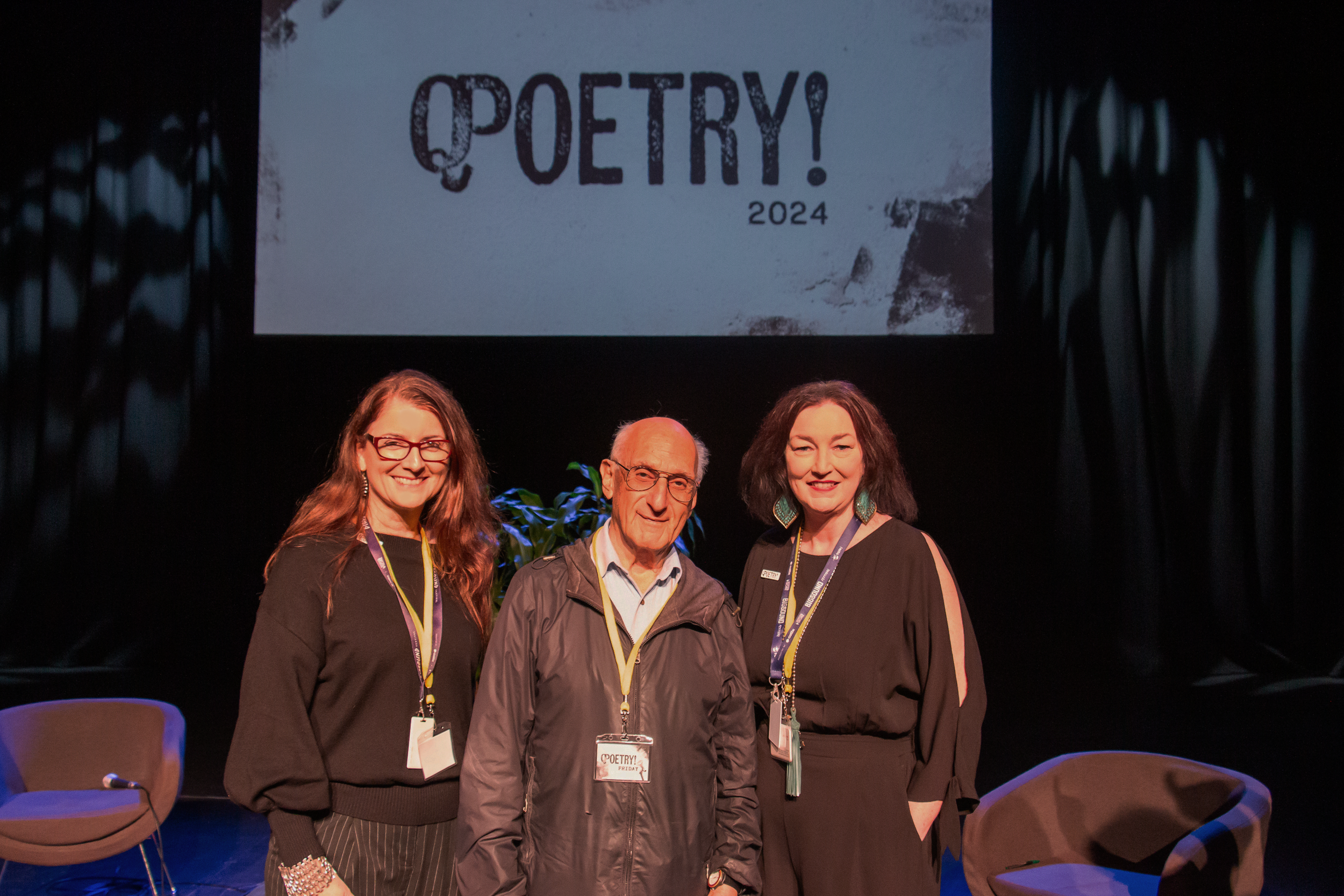
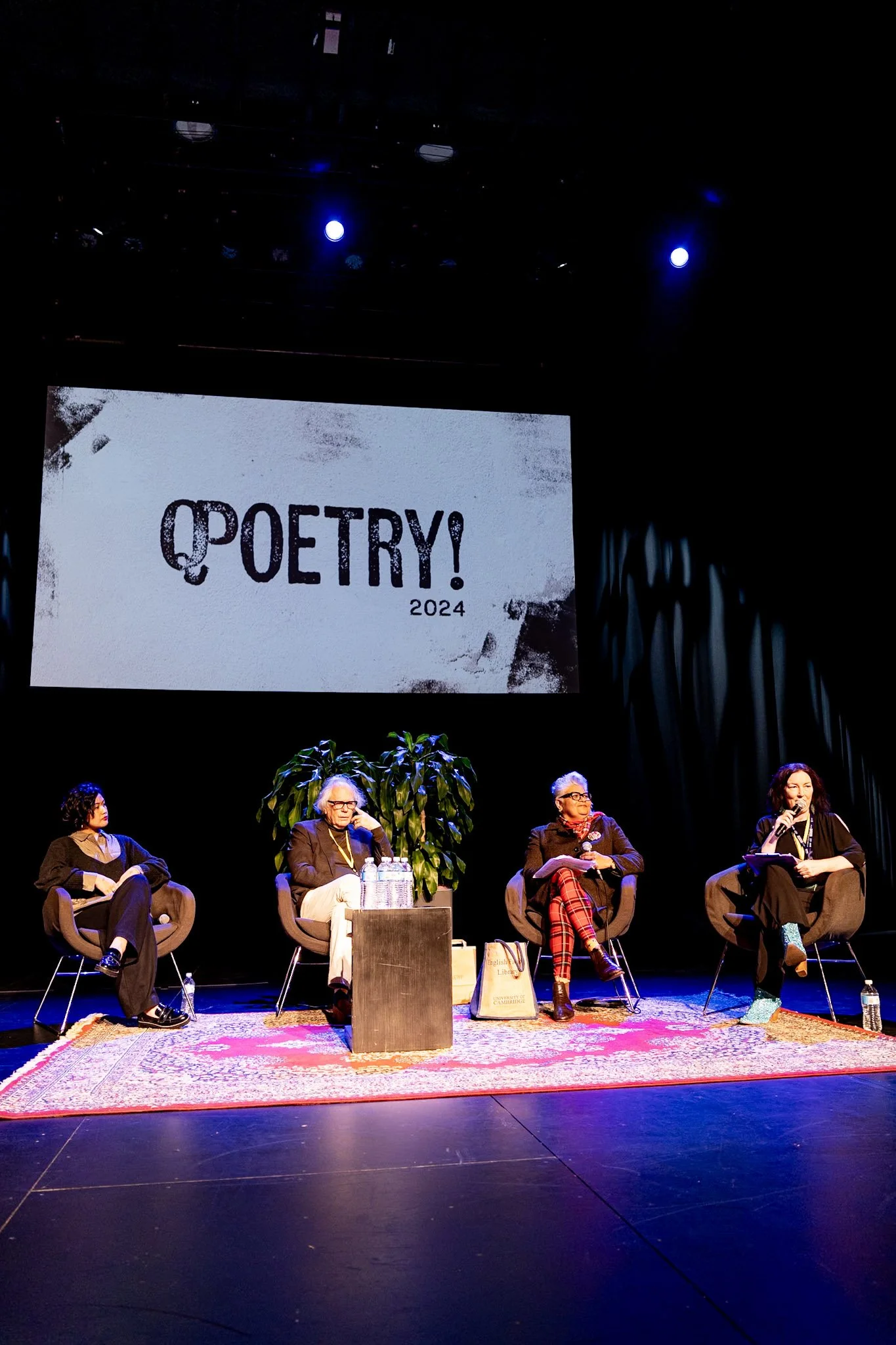
Working with Queensland Writers Centre’s CEO, I led the visual branding and logo design for QPoetry!, a new event that aims to celebrate contemporary poetry and community connection. The brief was to create a bold, modern identity that would resonate with emerging and established poets alike.
The final design combines clean typographic elements with organic movement, reflecting both the structure and spontaneity of poetry. This project allowed me to balance creative expression with strategic brand clarity, helping shape QPoetry! into a distinctive and recognisable program within QWC’s event offerings.
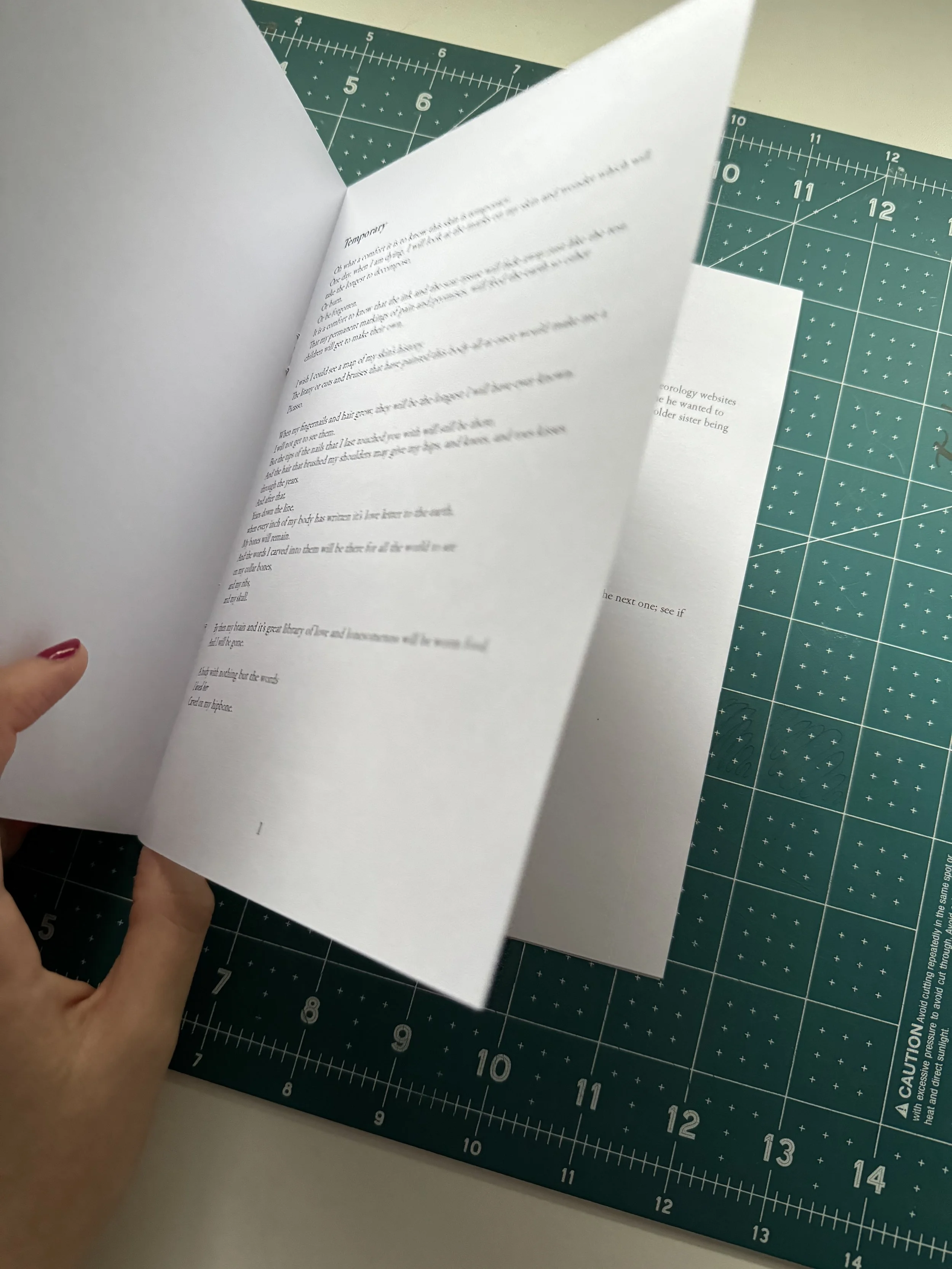
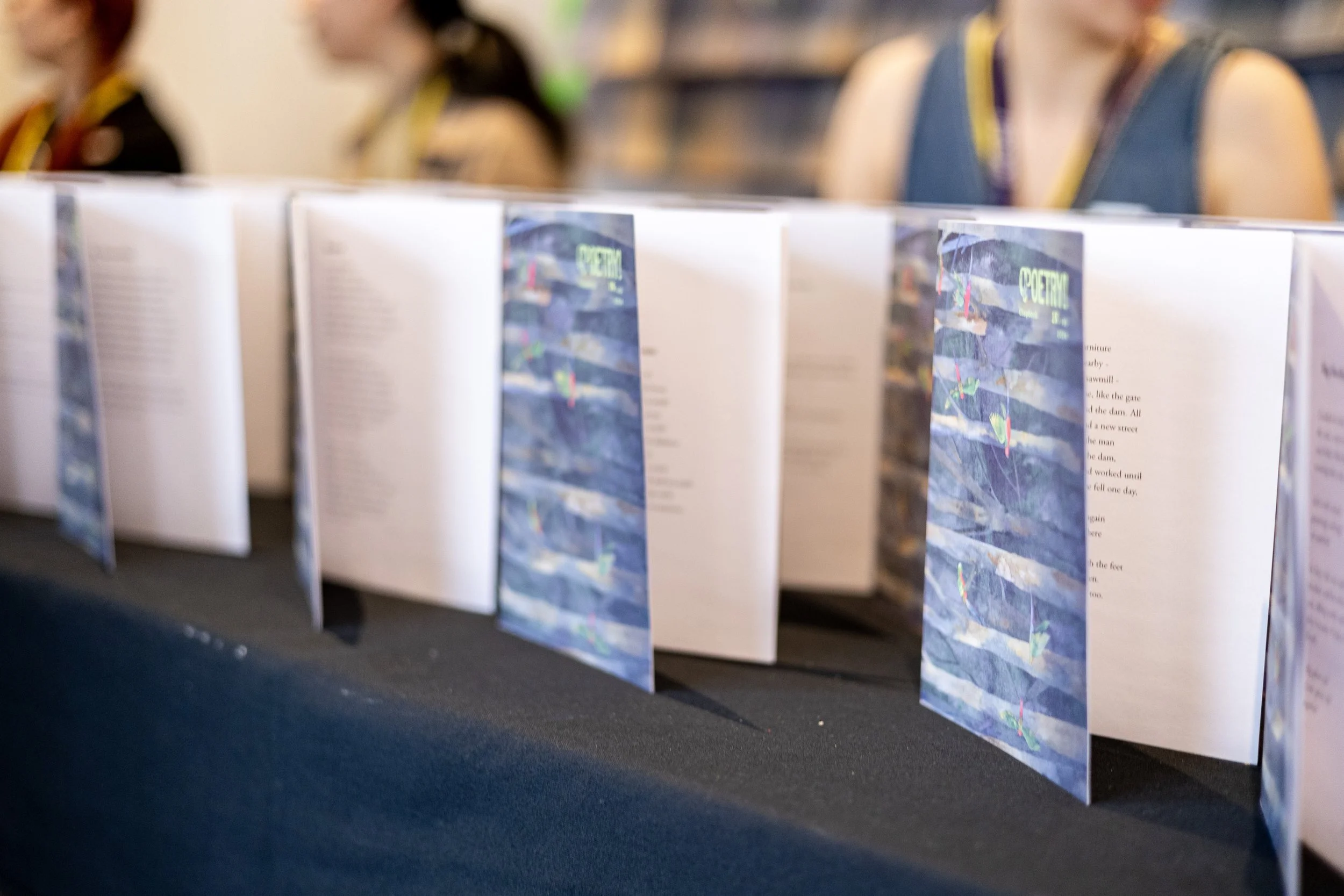
Chapbook Project: Common Fate
-
Typesetting
Forty-nine shortlisted poetry collections were individually typeset into eight-page chapbooks (cover included). Each one was uniquely formatted to honour the voice of the poet and the vision of the paired artist.
-
Printing
Print production for the chapbooks was entirely bespoke, with everything built from scratch. File organisation was essential — 49 unique interiors, each precisely paired with its corresponding cover. Interiors were printed in-house, while the covers were professionally printed to elevate the overall finish and quality.
-
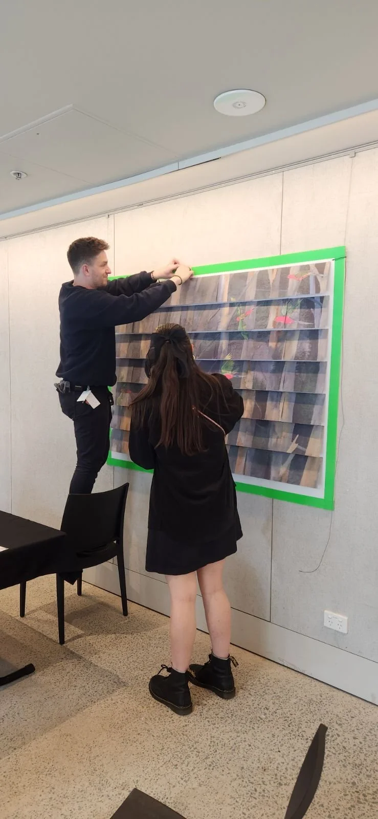
Construction
Three handmade copies of each chapbook were created — one for the artist, one for sale, and one for display. Every single one was typeset, printed, and assembled by me. The back of each chapbook featured a custom tile from a larger image, designed to come together as a complete version of the front cover when arranged collectively.